Key takeaways
Pros
- Knowledge base with innovative approach
- Great workflow with interesting elements
- Reasonable pricing
Cons
- Mandatory HelpCrunch branding in the cheapest plan
Getting started with HelpCrunch
HelpCrunch is a customer communication platform and a knowledge base software that offers a fairly rich range of communication options. Their toolset includes email integrations, live chat, pop-ups, and knowledge base. Mobile applications are also available. This review is focused on the knowledge base feature, but first let’s have a look at how you can get started with HelpCrunch.
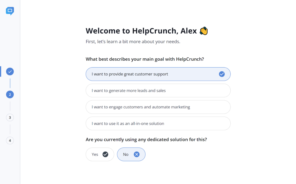
You can get started by registering for a free trial; all it takes is some basic information to get you started. There is no necessity to include your credit card information either, so you can get started without any strings attached. After that, you will be immediately taken to HelpCrunch and you can start answering some basic questions, including the purpose of your use.
You can also customize your experience and select widgets and tools you want to use. This is where you can first select the knowledge base widget as one of your primary tools for communication.
Once you get into the interface, you can take a look around and get the feel for it. Based on the first look, the HelpCrunch interface looks slightly unusual (in a good way) and incredibly focused. The interface is really clean and clutterless, and the design follows the same. It uses calm blue-colored accents to bring your attention to the right places.
The interface on the other hand makes very smart use of white space to keep you focused on the task at hand. It’s an interesting approach compared to overfilled interfaces we generally see in other help desk software. The first thing you’ll discover is a short video guide that can help you get familiar with the interface.
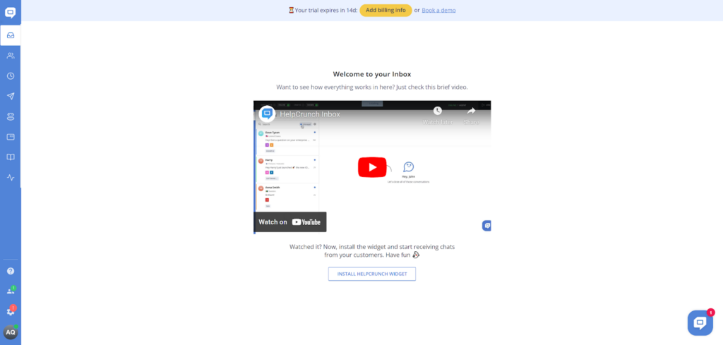
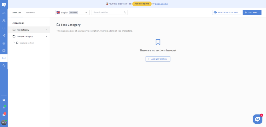
You can find the knowledge base (and other tools) in the left menu panel. The book icon makes it a lot easier to find, even without names and descriptions. Once you click on it, it needs to be activated first, which is a matter of just one click. The knowledge base already has a sample category, which means that you get some good organization options with HelpCrunch.
You can play around and get familiar with all functionality. You can create new sections and categories, as well as preview the knowledge base. Everything feels really well designed and you can see that the designers put a lot of thought into the user interface planning. I didn’t feel lost at any point.
User experience and features
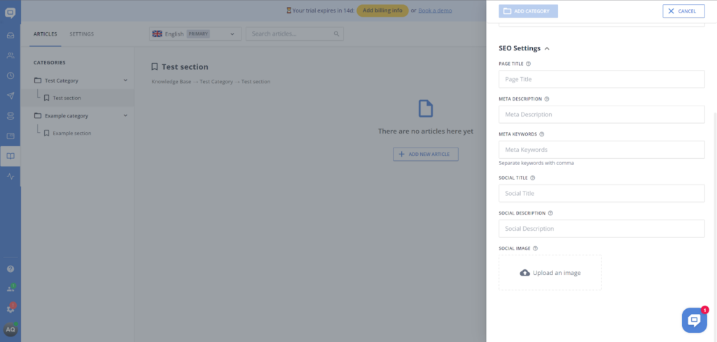
The category options are pretty great too. When you’re creating a new category you can not only name it, but also add a description for easy navigation. Furthermore, you also have the option to play around with SEO settings and make your knowledge base category more visible online if you want to. Lastly, you can add sections to your categories. These serve as sub-categories, so you can organize each subject of your knowledge base into the tiniest details. Overall, it’s pretty great and I don’t think there’s anything missing here.
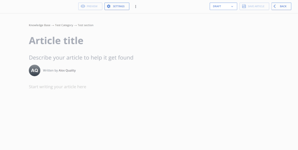
Now, let’s take a look at the knowledge base article editor. What surprised me was that HelpCrunch included a simple, minimalistic, but effective call to action on the blank article page. It also directly shows you where you can put your article title, a description, who the author is, and where the actual article text starts. This is done without any major website elements and everything looks like a part of the article editor. I’ll admit, it all looks pretty good! However, things change a bit when it comes to usability and availability of features.
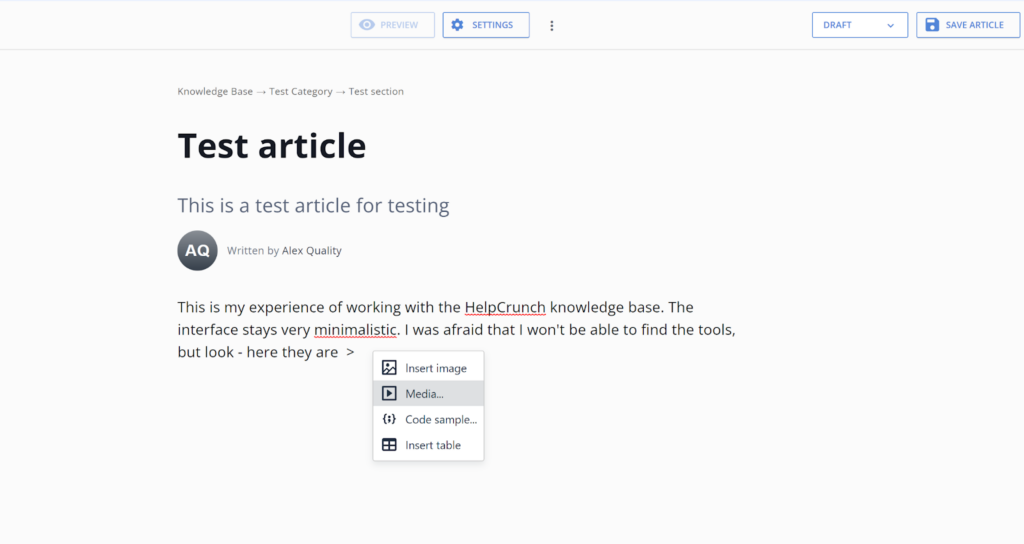
Where are all the tools? That’s what your first question is probably going to be. Well, they are neatly hidden and show up only after you click on where the article text starts. The selection is minimal, but strangely useful at the same time. You get only five options here – add a picture, add a video, add a code, add a table, or add a horizontal line. That’s it.
Where are all the formatting options? That might be your second question. Well, they are also neatly hidden and they only show up when you doubleclick on any text. At first glance, it’s a quite confusing setup, but the app is so intuitive that it doesn’t matter because you will find it sooner or later by simple trial and error. You can select Bold and Italics options (although no underline), change a piece of text into a header, create bullet points, change text alignment, turn text into a note, turn text into an info element, turn text into a red warning, or turn text into a tip. Simply incredible. This is not the richest feature set I’ve ever seen, but it’s just incredible – you get all the essential tools, plus something extra, so there’s really everything you need.
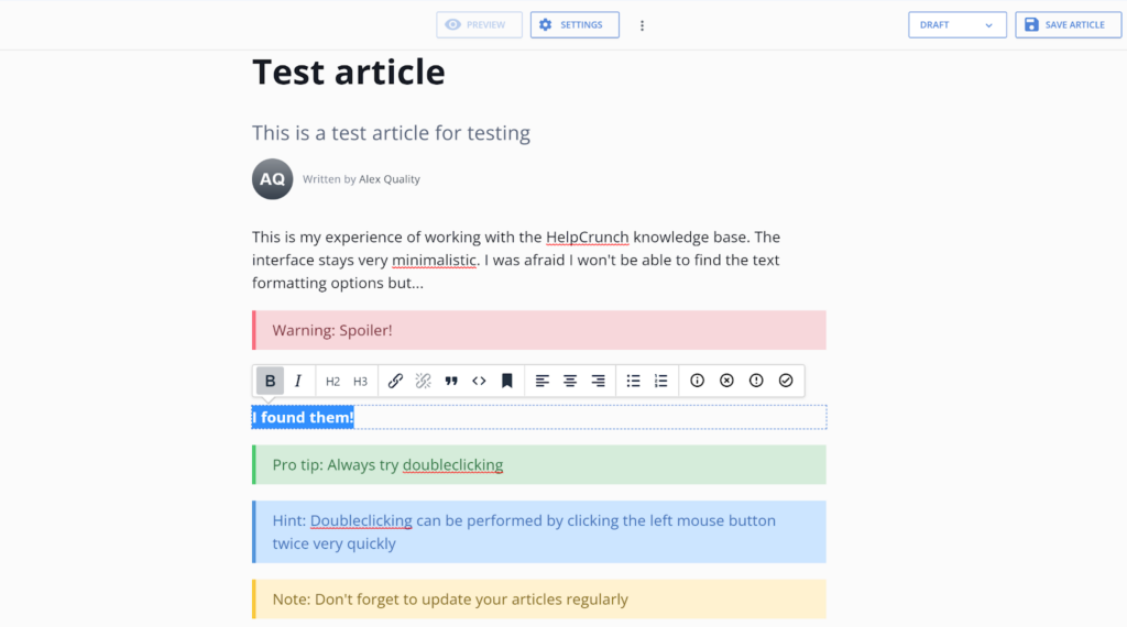
Overall, the knowledge base in HelpCrunch is very interesting and feels innovative. While the innovation doesn’t necessarily bring a change in the knowledge management game, it definitely feels great to use HelpCrunch and I enjoyed my writing experience immensely. More importantly, the innovation doesn’t ruin an already established workflow with the knowledge base or the article editor. Everything works as it should.
Pricing
HelpCrunch offers three pricing plans that get cheaper if you select the annual subscription. Each plan offers better features as the price increases. Let’s take a look at what you get in the HelpCrunch plans. You can get all plans with 20% off if you choose the annual subscription.
Basic
The Basic plan starts at $15 per month for one user and it gives you one widget, three auto messages, three popups, a monolingual knowledge base, full customization, basic automation, and live chat support. You also have mandatory HelpCrunch branding.
Pro
The Pro plan starts at $25 per month for one user. It ups your equipment with five widgets, 25 auto messages, 15 chatbot flows, advanced automation, and high priority live chat support. It also removes the HelpCrunch branding.
Unlimited
This plan is available only via the annual subscription, and the website doesn’t specify the pricing for one user. You get unlimited widgets, auto messages, pop ups, and chatbot flows, as well as a personal onboarding assistant. You also get all the previously mentioned features.
Conclusion
The HelpCrunch knowledge base is one of the best you can get. It brings a fair amount of innovation, but it stays down to earth and keeps the knowledge management workflow as we know it. There’s very little that’s wrong with HelpCrunch knowledge base and you can be sure that your experience will be simply great. All that needs to be considered is how you’re going to use the remaining tools in each of the plans.
Frequently Asked Questions
How do I customize the knowledge base design in HelpCrunch?
Go to the Knowledge Base and enter the Settings. Then enter the section Knowledge Base appearance and you can start customizing your HelpCrunch knowledge base. You can change the colors of your knowledge base to match your company brands, change the logo, add footer links, and remove the HelpCrunch branding if you have the right plan.
Are there advanced SEO settings in the HelpCrunch knowledge base?
Yes, and you can find them under Knowledge base > Settings > Advanced Settings. One of the most important options over there is Knowledge Base indexing, which allows your knowledge base to be found in search engines. There are also additional settings for SEO and social media in the same section.

 Български
  Čeština
  Dansk
Dansk  Deutsch
  Eesti
Eesti  Español
  Français
  Ελληνικα
  Hrvatski
  Italiano
  Latviešu
  Lietuviškai
  Magyar
  Nederlands
  Norsk bokmål
  Polski
  Română
  Русский
  Slovenčina
  Slovenščina
  简体中文
简体中文  Tagalog
  Tiếng Việt
  العربية
  Português


